
Peach Fuzz: Pantone’s Colour of the year 2024
This post contains affiliate links. When you purchase through links on our site, we may earn an affiliate commission. Here’s how it works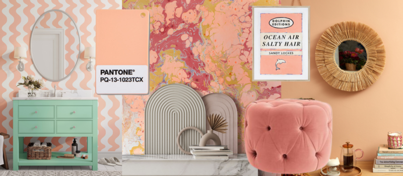
Back in the 90’s I was a bridesmaid for my older sister and I wore a very floofy, off the shoulder peach fuzz coloured dress with matching peach shoes. It was a “look” – and no I don’t have a photo to share easily – this was before digital photos thank goodness.
So you can imagine how ‘delighted’ I was when that creamy hue was announced as Pantone’s colour of the year for 2024.
Pantone 13-1023 Peach Fuzz
“Peach Fuzz is a heartfelt peach hue bringing a feeling of kindness and tenderness, communicating a message of caring and sharing, community and collaboration. A warm and cozy shade highlighting our desire for togetherness with others or for enjoying a moment of stillness and the feeling of sanctuary this creates”
Sensitive and sweet, nurturing and peaceful. You can’t help but feel relaxed and calm surrounded by this shade.
What’s all the fuss about Peach Fuzz?
Last month I was teaching ‘Styling for Interiors’ at Chelsea School of Art and I had a lesson on why the various colour of the year announcements are so important as an Interior Stylist and it starts with emails.
Forget about inbox zero
Within 20 minutes of the Pantone colour of the year being announced Interior Stylists and Interior Writers start to receive a ton of press releases with brand’s products in that colour. As it turns out Peach Fuzz is a hell of a lot easier on interiors than Viva Magenta – a gorgeous deep pinky colour that you can see here or Veri Peri – an almost impossible to colour match with products purple/lilac shade- no surprise there really.
It’s EVERYWHERE!
As I mentioned in my lesson, once you hear what the colour of the year is you’ll start seeing it EVERYWHERE – in fashion, in packaging and logos, and of course within interiors. There’ll be a multitude of sofas, lampshades, rugs and more in perfect – and not so perfect hues right in front of you. You’ll be in IKEA and suddenly their latest bedding has Peach Fuzz in it.
What does this mean as an Interior Stylist or writer? It means you can easily pull together a feature or shoot with exactly that trend. Why? Because Pantone Colour of the Year demonstrates that colour is a major part of a consumer’s decision to buy something or not.
But real people don’t really follow trends, do they?
Oh yes, they do. If you speak to an Interior Designer about trends they’ll quickly tell you their clients don’t follow them. They like to design rooms for the long term. Magazines on the other hand like to share what’s new and exciting but that doesn’t mean us Interior Stylists and Interior Writers are encouraging people to get out the paint brushes or to re-wallpaper their homes every year. We just want you to know what’s coming. After all, you read interior magazines and features to be inspired, right?
But Pantone isn’t an interior brand. Why does the colour matter?
It’s not just about paint colours. Pantone’s colour language is used by designers worldwide to access colour trends, communicate colour choices, and control the consistency of colour across every imaginable surface, texture, material, and finish, be that a new shampoo packaging design, the latest Chanel jacket colour or a paint colour.
Who chooses the colour of the year?
I’m often asked who chooses the Pantone Colour of the Year. It’s been going since 1999 (check out Cerulean blue below) and was originally set up to engage the design community and colour enthusiasts around the world in a conversation about colour and how there’s a relationship between colour and culture.
Each year Pantone gathers a group of their global colour experts who scour the world looking for new colour influences. The influence can come from films, productions, travel, art, aspirational travel destinations, lifestyles, “playstyles” or enjoyable escapes as well as socio-economic conditions. Influences may also come from new technologies, materials, textures, social media platforms and even up-and-coming sporting events that capture a worldwide attention.
Anything taking place in culture during the year can influence the Pantone Colour of the Year selections. Each source carries a different weight from year to year depending on what’s happening.
Laurie Pressman, Vice President, Pantone Color Institute™ tells it best.
“The Pantone Color of the Year selection process entails thoughtful consideration and trend analysis. It is a culmination of the macro-level colour trend forecasting and research that the global team involved with the Pantone Color Institute conducts year-round that informs this selection, as well as the colours that get included into our colour trend forecasting products.
There’s also a misconception that we gather a bunch of colour influencers in a room one day and emerge with the decision. As many of our Pantone Color Institute team members own their own design studios, contribute to key influential global trend forecasts, work with clients prescribing colour choices for brand or product visual identity, and even teach classes on colour, their daily conversations are rooted in colour and design, including material and surface finish. It is one long, continuously flowing conversation among a group of colour-attuned people.
We also consider the colour name in our selection process as names immediately conjure up an image and a feeling. We want to make sure that the name of our Pantone Color of the Year resonates and can easily and intuitively convey the message we are looking to send.”
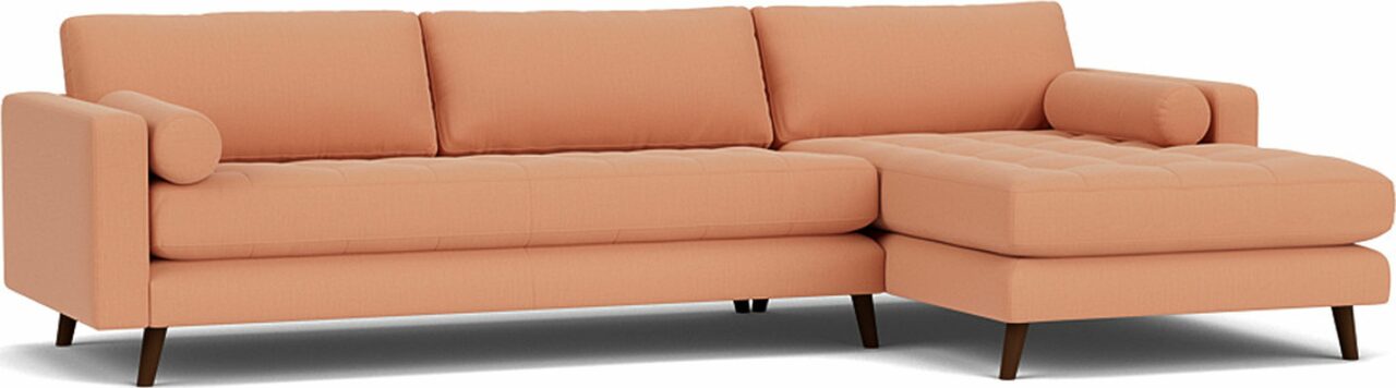
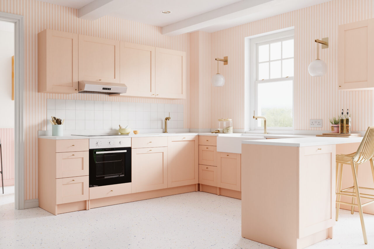
How to use Peach Fuzz within interiors
So, back to those press releases and all the lovely homewares shared with me so far (64 emails so far just on Pantone’s Peach Fuzz Colour of the year … and they’re still coming in!) Click on the images for more details of all the Peachy yumminess.


One last thing… Cerulean Blue
The very first colour of the year in 1999 was PANTONE 15-4020 Cerulean Blue. Ring any bells? The Devil Wears Prada should spring to mind. Remember this?

Leave a Reply
You must be logged in to post a comment.